Brand building to me it means building your brand, figuring out how to showcase your brand to let people know about you.
Identities to me means something people know easily.
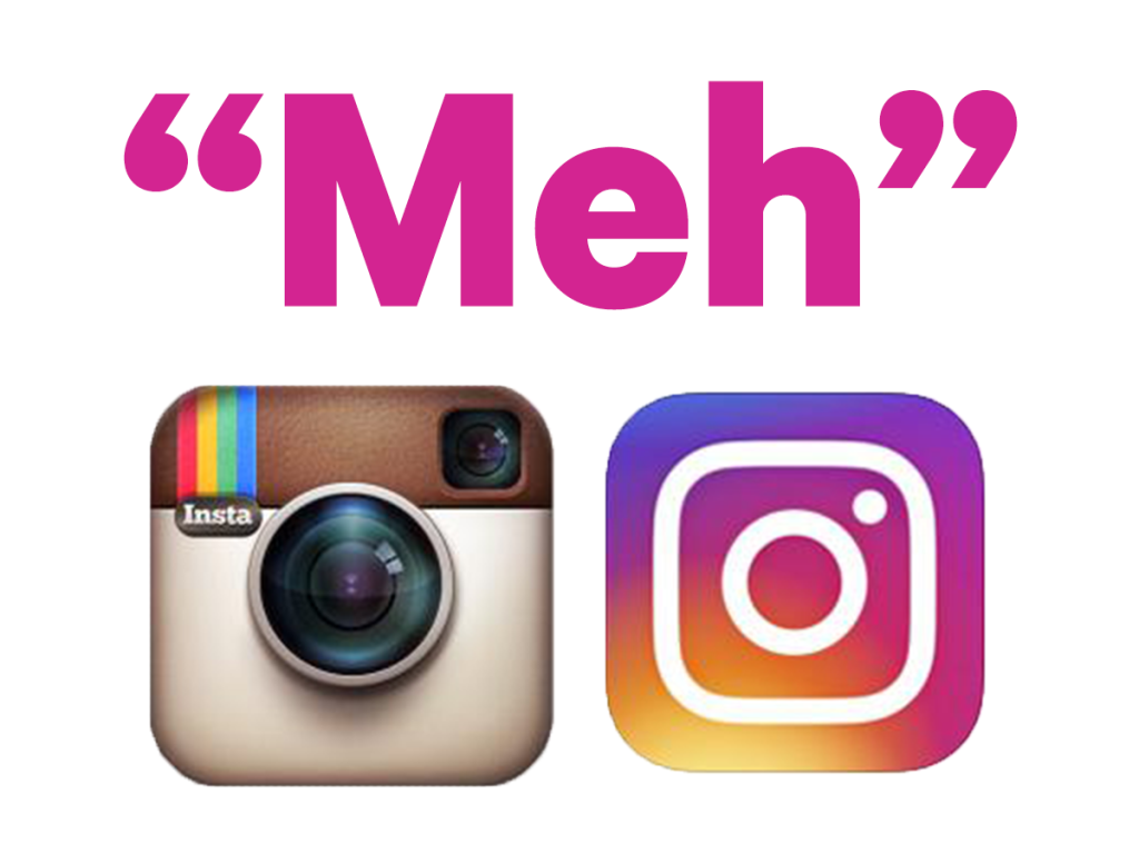
While reading The Theory and Practice of Motion Design pdf . I decided to talk about the Instagram logo because it is a well known social media. The logo is simple and if you show people the colour of the logo and ask them to guess what brand it is from. they will know it’s Instagram. Robert Padbury is one of the creator of the new Instagram logo.

Some people didn’t like the new logo look as it is simple, but this new logo does match with the minimalist look. Steven Heller said “Like anything that has been familiar, it’s hard to get used to a new mark,” but also the new logo isn’t a big deal. I also agree with me it doesn’t have a wow factor. To be honest, I don’t like both logos, but the first logo is suitable for what they do, but the new one is trendy and also for a anyone who does art, digital design know that the colour represent the gradient filter.
But the original creator of the Instagram logo Cole Rise actually like the new logo and said “Regardless of the colours behind it, the white shape—the actual bones of the new symbol itself —is beautiful,” Rise said. “I think that can persist over time”. I mean in a way he is correct, this logo can last a long time. Rise also said “But I think people will love the new stuff once they get used to it on their home screens.” Which is true.
This twitter video below it what I imagine everyone reactions to the new logo because it’s funny, but I know the process wasn’t this short, they had to plan, redraw, change colours to have the right meaning and the feeling behind the logo.
A New Look for Instagram
This video shows about the stages in making of the final logo. I like the way they made a video for the user and other people to watch about the creation of the new logo in a fun way. “a short making-of video that introduced the brand update through visuals and music.””a collaboration between the Instagram creative team and production studio Buck”. The video shows the steps and the process of the creation of the new logo. Designer of any kind can relate to this video because it does take time to improve or create something new.
Their goal was to keep the original look, but improve it. “Ways to honor the existing logo and retain the elements that people loved most about it:
the rainbow, lens, and viewfinder (Spalter, 2016).” Basically showing us that they are evolving and improving them self to be a better version of them self.
The important thing about making or redesign a logo is how do we want it to move and how do we want it to make us feel. But in Instagram case they didn’t do any movement, but we know that they a social media platform for posting video and photos.
Reference
[Business Insider].(11 May 2016) A top design expert says Instagram’s new logo change is ‘insignificant’ retrieved from https://static6.businessinsider.com/steve-heller-calls-instagrams-new-logo-not-a-big-deal-2016-5
[Newsweek].(12 June 2016) Instagram’s original logo creator says new logo is beautiful and timeless retrieved from https://www.newsweek.com/instagrams-original-logo-creator-says-new-logo-beautiful-timeless-458746
The Theory and Practice of Motion Design (pdf in trello)