Over the years we can see the changes of motion design work in movies. You can see the different style and improvement in motion.
The movie I want to talk about is Alice Through the Looking Glass because of the mix media it has, real life and animation.
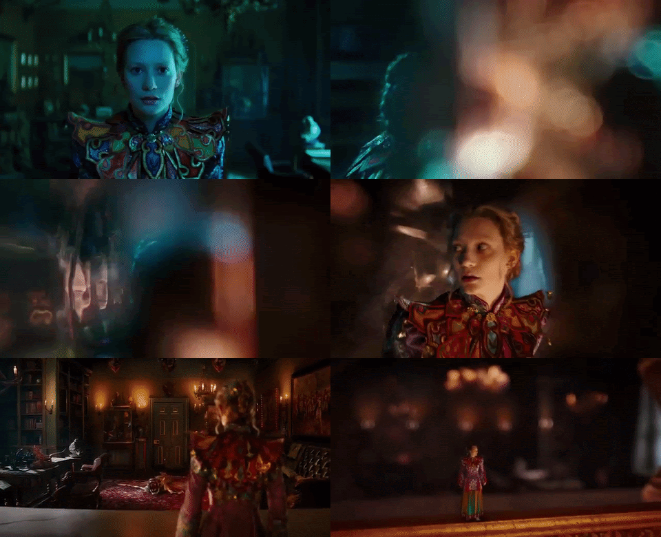
The scene I want to talk about is when Alice is running in the hallway, following the butterfly, goes into the mirror and falls to another dimension.
You can see all this in 22 seconds, it’s a very short time, but they have a lot going on the music match with the video.
When I look at that chosen shot more closely I can see the camera movement and the blue dull lighting when she is running. It is to make me think something going to happen. Our main focus other the Alice is the butterfly, Where is the butterfly leading her to.
Since this is a fantasy adventure film, of course there are going to be a special effect. I really like the transition shot from her leaving the dull blue room to an orange lit room. It’s really smooth and the kaleidoscope effect really shows she’s going to another dimension\ portal.

When she comes out of the mirror they made her small. This is another way other than the colour to show that she is in another place. A lot of close ups and zooming out, to see her emotion, surrounding and action.
The design and colour of this movie make everyone think that this is suitable for everyone.
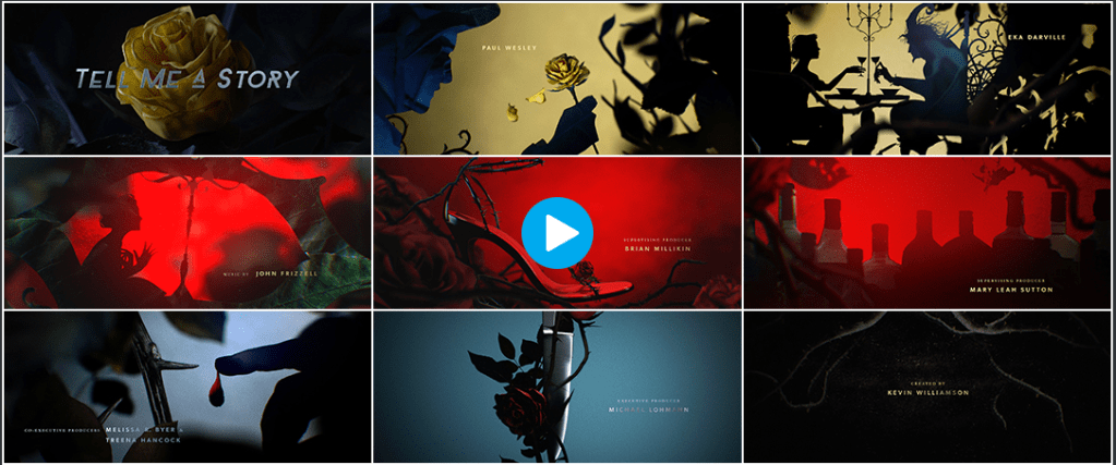
I found an animated version with a similar style as the movie called Tell Me A Story (Season 2) (2019). It has similar camera angles, the colours change shades and the music style.

In this video the main focus is what is moving in the shot. I like the reflection of the knife when it is moving it similar to when Alice and the butterfly goes into the mirror.
So when I look at both the video side by side, it’s really the transition that makes the design and music work because of the good flow and also the colours changes help too because colours have different meaning.
The main thing I should think more about is transitions and colour in my work, they help to make my story better, complete and have a nice flow.
This has some sort of horror/darkness, feeling because of the colour red which in this video means blood. It’s not a fun video which means there is a target audience and that’s not kids.
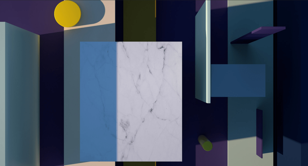
Ilya Tselyutin is one of the modellers /animator for Tell Me A Story (Season 2). I found an example of his work that I like that can be seen in both movie and the show. His specialities: Art direction, style frame and motion design lead.

This is a 30 second video, but it felt longer because of the transition and music. In this video I like the use of shadow and the camera movement because it is interesting and pretty to watch. The music is also suitable for the video.
Keeping my work simple is how I can make it better, straight to the point and not too crowded.
Overall all these examples I found they are different, but have similar technique that works. They all grab my attention and I understand what was going on.
Reference
[Movieclips Trailers].(29 Mar 2016) Alice Through the Looking Glass Official Trailer #2 (2016) – Mia Wasikowska, Johnny Depp Movie HD retrieved from https://www.youtube.com/watch?v=x3IWwnNe5mc
[Fanpop].MOVIE TRAILERS- Fan Art: Alice Through The Looking Glass GIF [website file] retrieved from https://www.fanpop.com/clubs/movie-trailers/images/40091958/title/alice-through-looking-glass-gif-fanart
[Art of the Title] .Tell Me A Story (Season 2) [website file] retrieved from https://www.artofthetitle.com/title/tell-me-a-story-season-2/
[Ilya Tselyutin].Colette[website] retrieved from https://ilya.work/colette